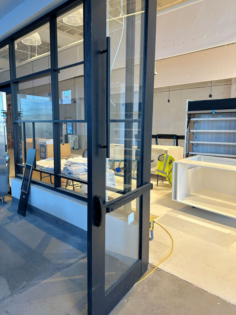
Shannon Tracey of Allegion sent me today’s Fixed-it Friday photo from a project where she wrote the hardware specification. I can’t even imagine how this happened or why someone thought it was a good idea. The good news is, it has since been fixed.
You need to login or register to bookmark/favorite this content.






That is a Norman Door
https://www.youtube.com/watch?v=yY96hTb8WgI&t=103s
Why put a Pull Handle on the push side of the door.
Pulls go on the Pull side of doors
Push plates go on the push side.
I’ve seen some hardware installations that were not done at normal speed… they were done half-fast , and this is one of them. Wow, and this looks like an aluminum door. If so, was the door replaced? If not, then how did they patch the errant holes and get acceptance by the architect and owner? It would be a shame to have a new door opening’s aesthetics ruined by plugs or patches on a beautifully finished door and framing system like this.
The company who installed it took full responsibility for the mistake and replaced the door! Wish I had photos to share of the final product!
Lori, I’m not sure what you are referring to but the top of the door looks warped. Photos are sometimes misleading from a focal point perspective. Not sure of what was the”good idea” or the fix. What am I missing?
Daniel, (Sorry Mark answering for Lori this week 🙂 ) I think the point is that the pull should actually be on the pull side of the door and not the push side of the door. Especially since we have a panic on the push side of the door. Also if you want to bring the code application into it…it would kind of go against the “Special Knowledge or effort” part of the egress code.
Measured from what they thought was the bottom of the outside of the door?
The pull is not needed and too high but not hurting anything. Perhaps it was intended for the other side but since there are no photos of the other side I can’t comment on the pull.
It’s always a hassle to get storefront hardware coordinated. I’m guessing the pull was supposed to be on the other side, though it looks a little high. I appreciate that the colors all match, so kudos there!