The 10th anniversary contest is almost over, so submit your feedback about iDigHardware, or click here to see other ways you can register to win! The winner of yesterday’s Yeti tumbler is John Menard!
~~~
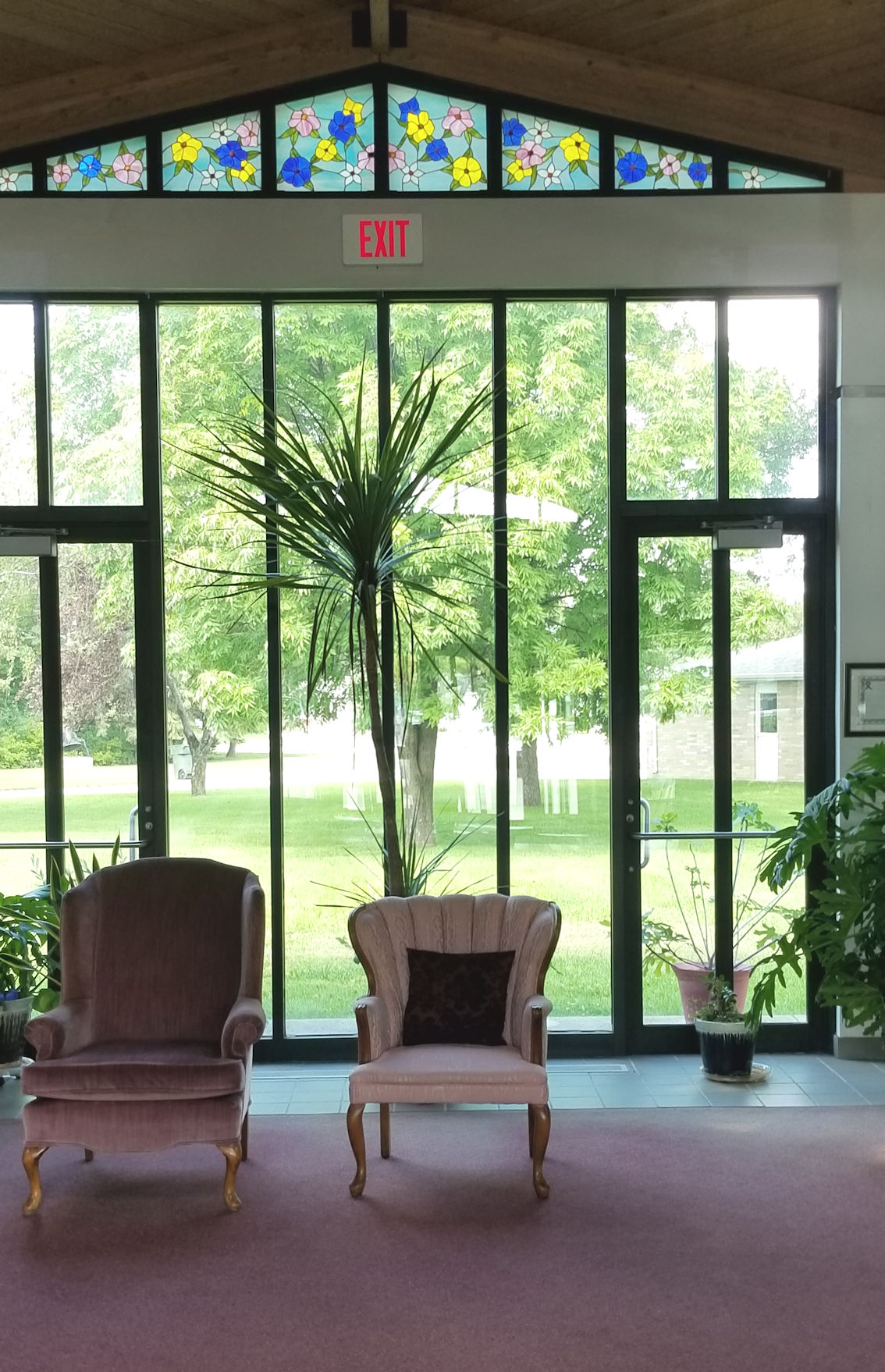
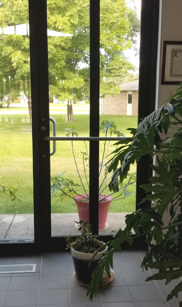
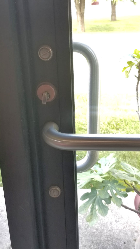
I received today’s Fixed-it Friday photos from Dave Cox, a fire marshal and deputy fire chief. The “fix” – potted plants inside and out – is obvious, but the design of the entire opening caught my eye (not to mention the thumbturn deadbolt). What do you think? Are these exit doors easily identifiable?
You need to login or register to bookmark/favorite this content.


In my opinion, no they are not identifiable. I think this would be an example why the code requires doors to be contrasting to the adjacent construction.
Get rid of the plants
Put panic hardware on the doors
We have a similar layout at our church. The door were to lead out to a future prayer garden and were not the main exit.
Probably not easily identifiable by the general public. I could see them fine, but those of us in the industry know what to look for.
Not exactly!
You don’t block exit doors with plants, silly! That’s where you put the brunch buffet table!! A shmear of this on yer bagel. Lox and Whitefish and kosher pickles! ….Oy vey!
Having just come from a “deaf / blind” exhibit, I wonder if the exit sign might be so high as to be missed by those with low vision.
In my opinion they are (sorta!). LOL
From an Architect’s standpoint, I would say the wider verticals, the head rail of the door, and the push bar lend themselves to identifying the exits.
However, the problems I see working against you are:
1. The single exit light. In a low light condition, the exit light centered in the larger opening could create confusion where the actual door is located. A simple fix would be to place one exit light over each door, positioned at the head of the door, not several feet above.
2. The push bar and deadbolt. An exit device, by it size alone, would bring more attention to the door opening versus the simple push bar.
The chair to the left appears to be encroaching on access to the exit/exit path, and oh yeah, get rid of the potted plants. Are they trying to camouflage the door openings?!!
Height of bottom rail of the door also does not meet current ADA requirements. A taller, compliant rail, would also help differentiate the exit.
Are those center rail/mullions in the middle of the door?
They still look like doors to me right away (exit doors? only if they are good about leaving the deadbolt not thrown). But I spend all day looking at doors/frame/hardware. So not sure how accurate it would be to the non-door minded.
If they can put the potted plants there, and looking at the narrow walk beyond, these doors don’t seem to be “main entrances” that could be deadlocked.
Two exit signs – one above each door – would help guide people to the doors better than the single sign over neither door
Kind of hard to distinguish the doors from the rest of the glass wall. Then place plants in front and beyond them to camouflage them more. And then thumb turns which would be hard to see, God help us!
They scream door, exit. Door closer, size and shape , push bars, pull handle on outside visible from inside, thumb turn cylinder and exit sign
First, I doubt that this is the main entrance and as such deadlocks are not allowed. I think that exit sign is too remote from the openings, but the bigger problem is the potted plants. These are in the egress path and cause confusion and certainly tripping hazards. The placement of decorations in churches is all too common as congregations want to be ” warm” and “inviting”, but they fail to recognize that this is an Assembly occupancy being visited by people who may be there for the first time. The church leadership is neglecting their obligation (under code) to maintain the egress path in the facility and putting both regular attenders and visitors in danger.
A simple relocation of the exits sign, should be one over each door could have helped. Perhaps due to occupancy a panic exit device would have been a better choice… but hey that’s what locksmiths were born for . Retrofit
From an architect’s viewpoint, here is what I see. Plants and furniture blocking is a fire code issue that’s always enforceable. (Fire marshals have a lot to enforce with little resources)
Looks like this exit was designed as a main door for egress requirements. Several designers and AHJs consider exterior doors the main criteria for this requirement. But the exception for main doors is for doors that are unlocked when the building is occupied. In this case, the building users are unlikely unlocking these doors. If the owner doesn’t what the doors used as an entrance, then remove the pulls. In general, users leave buildings through the doors they used to enter the building.
This exit does not meet accessible egress requirements. (Flush 10 inches at the bottom of the door required and the turn is not accessible) That would be allowed if this was a third exit from the space or the building existed before accessible egress requirements.
All the code requirements above are “out of the box” IBC requirements.