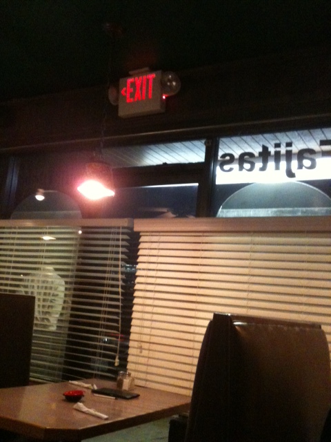
I have to admit, I do like to sit where I can see the exit. But this might be a little too close for comfort.
It’s possible that the door is no longer required as an exit, hence the arrow to the left, but I think it could be confusing, especially in a fire. I’m working on an article for Doors and Hardware about calculating the egress width, which would help determine whether this exit is required or not.
Happy Thanksgiving everyone! And thank you to Jim and Debbie Campbell of Allegion for the Wordless Wednesday photo!
You need to login or register to bookmark/favorite this content.


Is that the actual exit or extra door
Arrow on sign points you to go in a different direction
I can’t say for sure but IMO they should have removed the sign if they didn’t need the exit. My guess would be they didn’t go through the calculations to see if it could be omitted.
Yes bad placement
My take it is pointing to another door some where else, not the door seen.
You’re an optimist. 🙂
I’m not so sure I even see a door.
The arrows on most models of EXIT signs are knockouts and a bit of rough handling can knock out an arrow which is not intended. If the building operators are willing to cover an exit in shades, they certainly would not replace a sign which is now wrong.
My 3 cents Canadian.