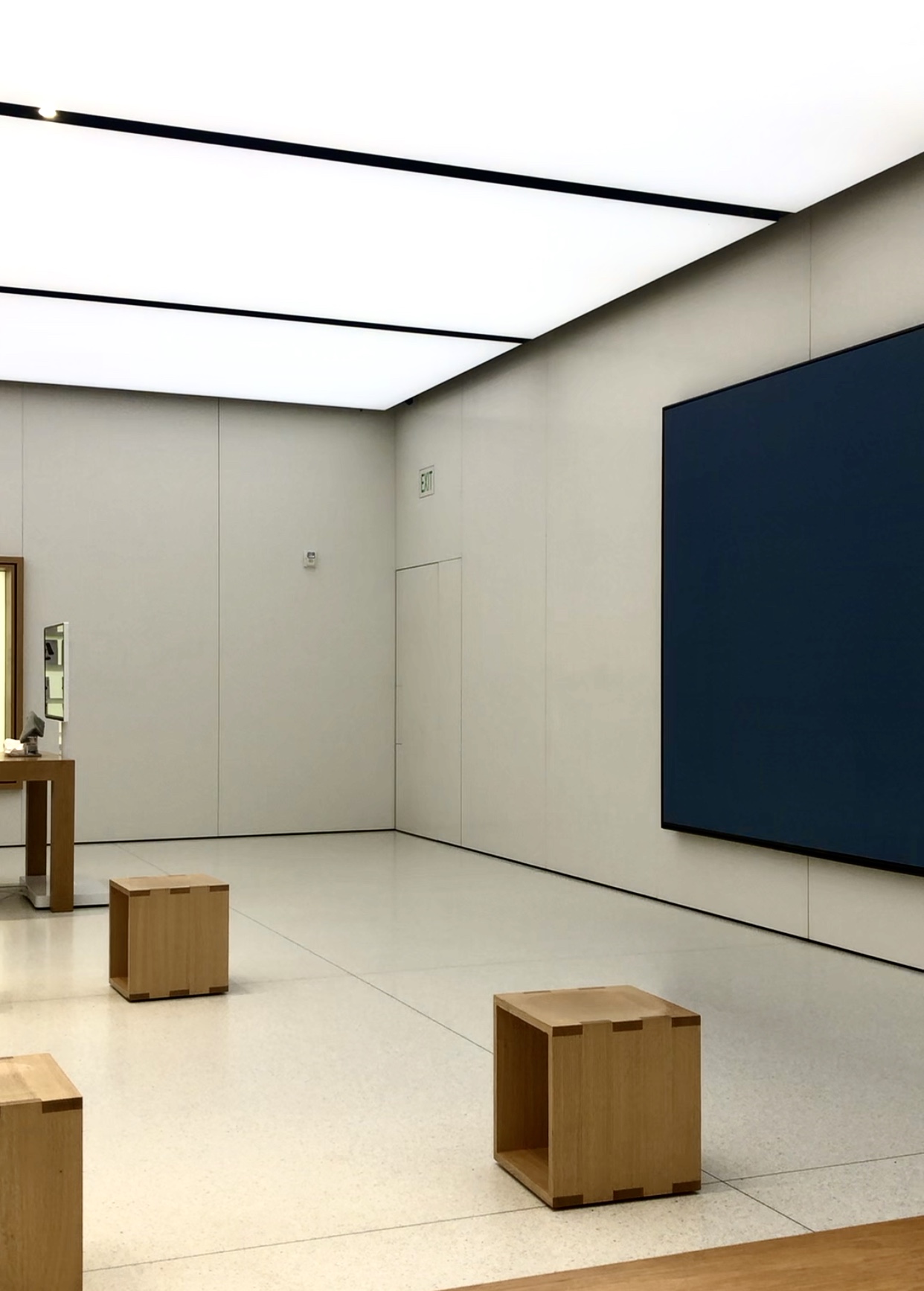
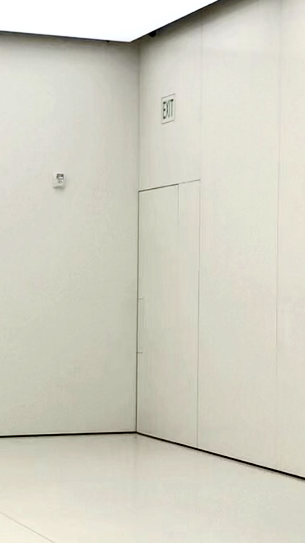
I have not traveled far from my home for more than a year, but this week I had the opportunity to combine Covid vaccination appointments for my son and myself with moving my daughter out of her dorm room for the summer. Yesterday we had a phone emergency which led us to visit a very popular store that had some of the best Covid precautions I have seen anywhere. But when the salesperson sent my 19YO daughter through the marked exit to the restroom, I watched her struggle to open the door. This is a kid who has been on the dean’s list every semester and has been forced (by me) to look at doors for her entire life – if she had a hard time figuring it out, I think others would too. There was no push plate – just a line etched in the door face.
The IBC states: Doors in the means of egress shall be readily distinguishable from the adjacent construction and finishes such that the doors are easily recognizable as doors. Mirrors or similar reflecting materials shall not be used on means of egress doors. Means of egress doors shall not be concealed by curtains, drapes, decorations or similar materials.
Do you think this door is “readily distinguishable”? Is it a problem, or no big deal? WWYD?
You need to login or register to bookmark/favorite this content.


The word EXIT could have been engraved into the “invisible” pushplate, IMO. Something that “fruit” vendor could have integrated into the ID aesthetic.(PS I prefer citrus, myself)
Exactly! 🙂
– Lori
Lemme guess, the door pushes open but it’s flush to the inside wall face. Uses and EZJamb ISD frame? With no obvious way to open the door, how many people, even in our industry, would think of that in a panic situation? I don’t really have a problem with the door/frame design as long as the hardware makes the operation obvious.
I couldn’t get close enough to check out the frame – part of the Covid precautions were that we had to stay at our table (except my kid, I guess :)). But the face of the door is flush with the face of the wall.
– Lori
Yes, I would definitely agree with you, not code compliant.
I cited CBC 1010.1 on a T.I. project of a large company, but they wielded a big stick and got their way with the CBO (from the previous City I was with). On their Door Schedule, there was a note that stated, “Door finish to match adjacent walls”.
this is the new architectural design the architects think it is great that you don’t see the doors. I think this practice is a problem these type of doors should not be installed.
It would seem that “readily distinguishable from the adjacent construction and finishes” would imply that the door color/finish (and hardware) must be of some level of contrast to the adjacent finishes. This door clearly doesn’t meet that requirement.
I’d have to say no to ‘readily distinguishable’.
paint “DOOR” vertically on the surface in letters about 2′ high.
good idea
I will be 80 this month, having worked full time until I was72 so I find myself rusty. If I were inspecting, I would guess that I am looking at a door in a movable wall, like in a hotel meeting area. There is no visible hardware with which to operate the door that I can see in the pictures – I might be lead to it in a fire by the exit sign – then what? l would have to take a look at handicapped requirements. It is tight against an adjacent wall without handicapped approach and operable hardware. The exit light does not have illumination from all appearances and I would guess the general lighting was not designed to serve as egress lighting and depending on occupancy might not need it but practically, it would not provide much egress assistance if there were smoke around. I would not want to be nitpicking but egress should be more clearly identifiable.
. Thanks for the opportunity to comment, gives my memory some excercise.
Please keep commenting, Jerry! It’s not a moveable wall but it is a white door in a white wall and the area to push just has an etched line around it. And the edge of the door is right in the corner. It’s really tough to see.
– Lori
I can only assume that the plate I see near the corner of the wall is the push plate to exit? But definitely not clearly marked at all
Yes – it’s not a plate, just a line around a flush area on the face of the door.
– Lori
DANG!
Bare minimum it needs another sign on the adjacent wall.
My first though was, “What door? Where?”.
IMHO: nice closet, nice communicating door, nice ‘secret office’, terrible path of egress … this is a problematic design.
Ok for home use
I agree with Lou, they need another sign with an arrow. If the two “crates” are used as seats, that may imply that the exit access is along the wall. From any angle close to the wall you can not see the sign…. let alone the door!! Looks to me that the sign is not illuminated as well!!
I read “readily distinguishable” as “readily distinguishable visually from all points in the space from which people would be seeking that exit in an emergency; or at least half way across the room”.
Also ask yourself, “If the room were hazy with smoke, does it look like a door?”
First, I must say that it is good to see another old hardware veteran (Jerry Austin) offering comments.
This application is terrible for all the obvious reasons stated above. If I recall, accessibility codes call for 18″ of clear space from the lock stile, for maneuvering on the pull side, so why would we allow a perpendicular wall so close to the lock stile surface on the push side of an alleged exit?
I’ve seen hundreds of similar doors over the last 50 years that I considered deficient due to a lack of being readily distinguishable, but this door stands out as the most egregious I’ve ever seen in my years of travel. No frame, no vision panel, no door operating hardware, no kick plate, no signage, no pull station. Even the exit sign appears to have been blended in as much as possible. To sum up the competence of all of the professionals involved in the design, spec, review, build, inspection, etc…. MAJOR FAIL!