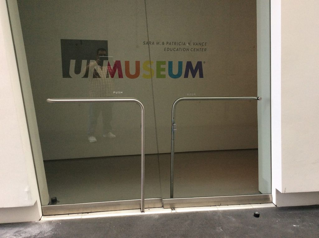
Last week I posted a Wordless Wednesday photo and some of you doubted whether or not it was authentic – it’s not my photo so I can’t say for sure, but I think it is. Today’s Fixed-it Friday photo is not an April Fool’s Day joke, the result of a bad camera angle, or an image that has been Photoshopped. It came from Anthony Romero and was taken at the Contemporary Arts Center of Cincinnati. The doors are skewed to the left, and it looks like the floor is sloped. The hardware is horizontal, as is the graphic on the wall.
Update: When I set up this blog post a few days ago I had no way of knowing that by the time Fixed-it Friday arrived, the inspirational architect who designed this building would have passed away. RIP Zaha Hadid.
Zaha Hadid’s 10 best buildings in pictures – The Guardian
You need to login or register to bookmark/favorite this content.


Are the doors also backwards for flow of normal traffic?
Are the doors “balanced” doors also,looking at where the floor stop is located?
Yes, they are swinging in the opposite direction of what is normal for a double-egress pair. They aren’t balanced doors but they are hung on center pivots which can move the pivot point in from the edge.
– Lori
I wouldn’t ask this if it was any other architect but, do you think it was intentional?
I’m not sure whether the doors were designed in response to the floor situation or whether the whole thing was planned in advance, but I don’t like them!
– Lori
Look at the distances from the latch to the hinge.
Those doors are reversed.
The left leaf is larger than the right leaf.
Rightey Lefty…… Lefty Rightey
Flip em and all is good.
LOL
Lori: Definitely a door gone askew as they say. Why anybody would put a door in an opening like that – especially glass doors should have their head examined. In some respects this is laughable, however reality is someone actually installed it and thought it was appropriate. GO FIGURE? Does anyone want to take bets on how long this hardware will effectively work ? The better question is does it even work now? The floor at this door opening should have been leveled and ramps provided to meet ADA requirements on both sides of the door. Definitely a Rube-Goldberg !!
David S. Kenyon RA, CSi
Though the top of the door isn’t visible, I strongly suspect that the doors pivot about a vertical axis. The reversal of left/right doors from normal convention was probably done to encourage visitors to have the “weird” experience of pushing through a left side door, but I would not be at all surprised if both doors could swing in both directions. Such a design would be unsafe with an opaque door, but two people approaching a glass door from opposite sides should be able to see and avoid each other.
Doors are deliberately “skewed”… and double egress to boot! The site line between the doors shows that they are angled in vertical. The vertical portions of the locking push bars are perpendicular to the ground and the horizontal portions are parallel to the ground, but the meeting edge of the doors is askew. With the lettering on the wall indicating “unmuseum”, I would say this was very much deliberate.
I agree with you Jerry. This was intentional. The doors are built to match the slope of the floor and the walls. It was designed to look like this (like it or not). I can see how this played out when the door supplier saw the details. They probably tried running away thinking the architect was crazy but it makes sense if they want to maintain the sloped floor. I don’t particularly like it but I think it’s a good solution to an unusual problem and I don’t think there should be any issues with the hardware because of it. Hardware templating was probably a challenge but a little geometry refresher should make it easy enough.
Someone is “pulling your leg”. And, they are very good with Photoshop.
Gives me that Alice in Wonderland feeling.
The floor and frames are level and plumb.
The unmuseum sign is skewed, the pulls are skewed.
The facility I used to work in had a pair of RHR DE doors in one of the corridors. I asked the resident PE why they were RHR instead of LHR, and he said it was to direct traffic towards a nearby exit stairwell.
Was that the truth? I don’t know, but I don’t think so
It was probably true…there is no rule in the US about which direction the doors have to swing, but I think I saw something in a Canadian code once. They are usually RH/RH because of traffic flow, but sometimes they’re the opposite because the door swings in front of another door in that configuration.
– Lori