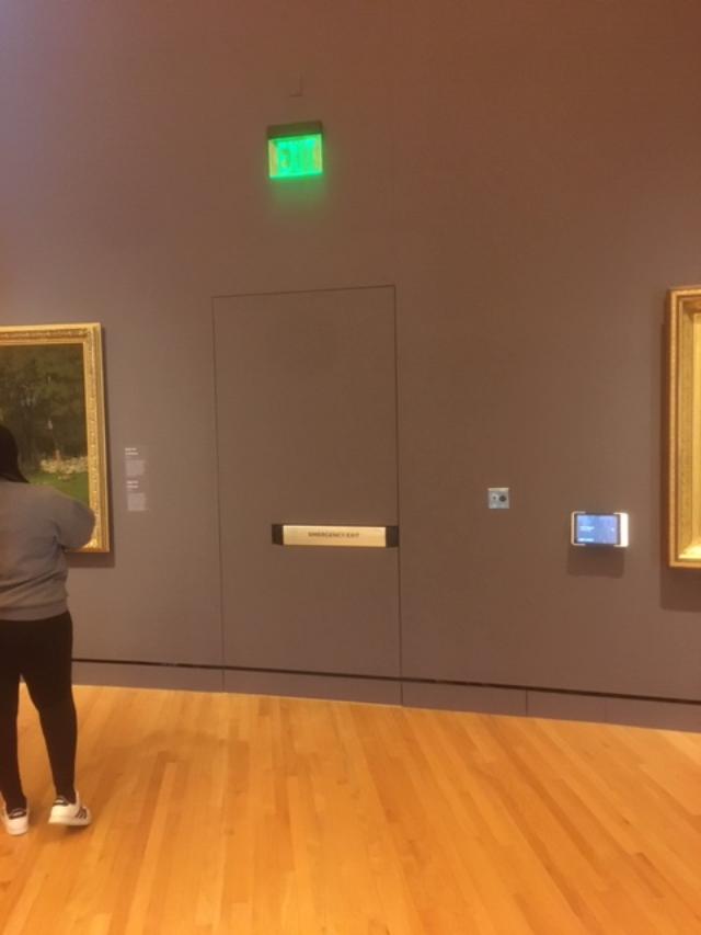
Last week I received this photo from Terry Crump of Butler Doors, asking about the code-compliance of the exit. The crazy thing is…I wrote the hardware spec! 🙂 This door is an emergency exit in one of the galleries at the Crystal Bridges Museum of American Art in Bentonville, Arkansas. It was a tough project to specify hardware for, but I love a challenge. I haven’t been to see the museum in person yet, but Terry said the hardware looks great (the buildings too!). There’s a video about the project here.
So…I know that this door opening was approved by the AHJ. I remember that the door was flush to the wall (this usually requires special hinges) and had a recessed Von Duprin Inpact device. I hadn’t seen the color, but I’m not surprised that the door matches the wall. It looks like the “emergency exit” text has been added to the panic.
The International Building Code (IBC) says: “Means of egress doors shall be readily distinguishable from the adjacent construction and finishes such that the doors are easily recognizable as doors.” However, the US model codes do not offer prescriptive requirements to clarify what would be considered readily distinguishable. There are no specifics about color contrast or whether the push-side face of the door and the wall can be in the same plane. That means it is left up to the AHJ to decide, and in this case, the exit was deemed acceptable. Do you agree?
My specwriting days are over, but I have more than 100 coworkers who can help with your hardware specifications…if you’re not connected with your local Allegion project coordinator, you can send a message here.
You need to login or register to bookmark/favorite this content.


A piece of Art!!!
Does it go to a corridor ???
Hi Charles –
I don’t remember exactly what the egress route was, but I think it led to another corridor because I doubt it went directly to the exterior. You’re closer than I am…if you ever get over there, send me some more photos! 🙂
– Lori
I understand that there is no Clarification in the modal code about what is or is not called “Distinguishable and Recognizable”, but usually when trying to make a Door Flush the concept is to make it shouldn’t be Recognizable.
Wow. This is really a gray area (no pun intended). Had they used an integrated door assembly with a painted exit device I would say no way. The exit device is still distinguishable, though.
I’m not sure how this door is “readily distinguishable” from adjacent finishes, because it has the exact same finishes, both material and color.
I’m not sure how this is “recognizable as doors” when it is intentionally disguised as a wall.
I think the AHJ was being exceptionally kind.
As far as noticing it goes, the exit light helps as does the contrasting panic color but I know what I’m looking at. I’d have to get the opinion of a lay person. Designers love the EzyJamb ISD frame but they have no idea how it affects the doors and hardware. And based on the jobs we’ve seen, neither do most spec writers. The recessed panic is one I haven’t seen with this door/frame combo before. Add a whole new twist.
As an AHJ, I would NOT allow this!! What makes it worse is the bottom of the door looks like the surrounding walls, thus making it blend in even more. Definitely NOT “readily distinguishable”. Looks to me like it could be a missing painting and the strike plate is a brass plaque describing the painting that is not there!!! Although code compliant, the green LED exit sign doesn’t help!!
Thus my reply further down the comments that the particular
AHD, in my opinion, was a “brain-stem”
Maybe its a piece of art. Now that would be interesting. Lori: What if a painting looked like this? Its not a door; it just looks like one. You can buy it for $250K.
Jim
Maybe that should be my retirement activity – selling paintings that look like doors! 😀
– Lori
Interesting problem here. When I’m in an unfamiliar place usually the first thing I look at are the exit doors. A door, IMO, should give one information about its operation. For example when someone mounts a pull on the push side of a door, confusion reigns. In this case , the panic bar is to the side and, to me, obviously indicates which side of the door to push. [Clearly not a fan of ‘center’ door operators.] More importantly where’s the required ADA Exit sign at 60 inches on the strike side of the door?
Good question! I wonder if the omission of that signage was part of the request to the AHJ?
– Lori
I imagined that there was a fire in the gallery and I needed to get out quickly. I am afraid that I might not know if I was looking at an exit or some artwork that looked like an exit. I would probably look elsewhere because it would be difficult in an emergency situation to know what happens when I press the fire exit hardware (or panic hardware as the situation dictates). Will operating the hardware result in an expected reaction from the wall (door). I had my wife look at it too. She thought it looked like too much effort was used to disguise what should be more obvious. I hope this does not disappoint you.
Don’t worry Jerry – it doesn’t disappoint me! It can be tough for a door hardware consultant to walk the line between helping the architect get the result they’re looking for, and making sure the door will function properly for the end user, AND keeping it all code-compliant. I’m not personally attached to the design – I just thought it was cool that one of my projects showed up in my inbox years later. Thank your wife for her opinion! 🙂
– Lori
If the AHJ claims to have no problem with this then any occurrence that happens from this point forward is on them . Each Jurisdiction even in the same state or province can interpret the code . However if a dispute arises then the state or provincial marshal can make a ruling.
The hardware along with the exit sign makes it compliant in my opinion. however I would like to see the Exit sign installed just above the door at a reasonable height per ADA. Remove the hardware or exit sign it would be non compliant of course. I think it meets the minimum intent when most folks would see it as a door. The approved hardware is key to me. Are there any other exits accessible or is this the only one?
Hi Donnie –
There are definitely other exits that are more obvious, and this is not the main entrance/exit to the gallery.
– Lori
Lori wrote: “Good question! I wonder if the omission of that signage was part of the request to the AHJ?”
IMHO, that would be an extremely risky request for all parties. ADA 703.3 is pretty clear about signage requirements. Further CBC 1009.1 (presume this is similar in the model code version) notes that required exits are also accessible. Just sayin’
NO. Does not rise to the level of what I would deem acceptable – in terms of a Visibly Distinguishable. I understand as an employee, one seeks to do what the customer wants.. but even if one acquieses’s, in my humble opinion, that AHG was a “brain-stem”
This is another example of why the model building and fire codes should not provide as much discretion to an AHJ as they currently do.
Most who have been in this business for a while have figured out that larger municipalities with highly trained and experienced personnel would rarely approve an arrangement like this so they wouldn’t even bother trying. In my own experience, I’ve found more often than not that small town and rural area AHJ’s simply don’t have the education or experience and commonly don’t know more than the very basics of the codes they are entrusted to enforce.
And another sad truth is architects commonly exploit AHJ discretion for whatever design consideration they may be angling for, knowing it is an excellent gamble that the AHJ may approve what is being requested. At the same time many AHJ’s are intimidated by the education, credentials, licenses, reputation, etc. posessed by many architects and can be too trusting that the architect is doing what is right or even knows what they are doing and be oblivious that AHJ discretion is just being manipulated.
WOW this post has had me thinking! I love that you used a device that has lots of surface area to make it stand out even more then a thin bar would. But the concept of “readily distinguishable” is almost impossible with a glass door. People walk into the side glass panels on a good day. An all glass door is transparent so impossible to be “distinguishable” except for the hardware and lots of that on all glass doors is very thin.
I would love to see more about this topic.