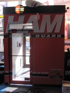
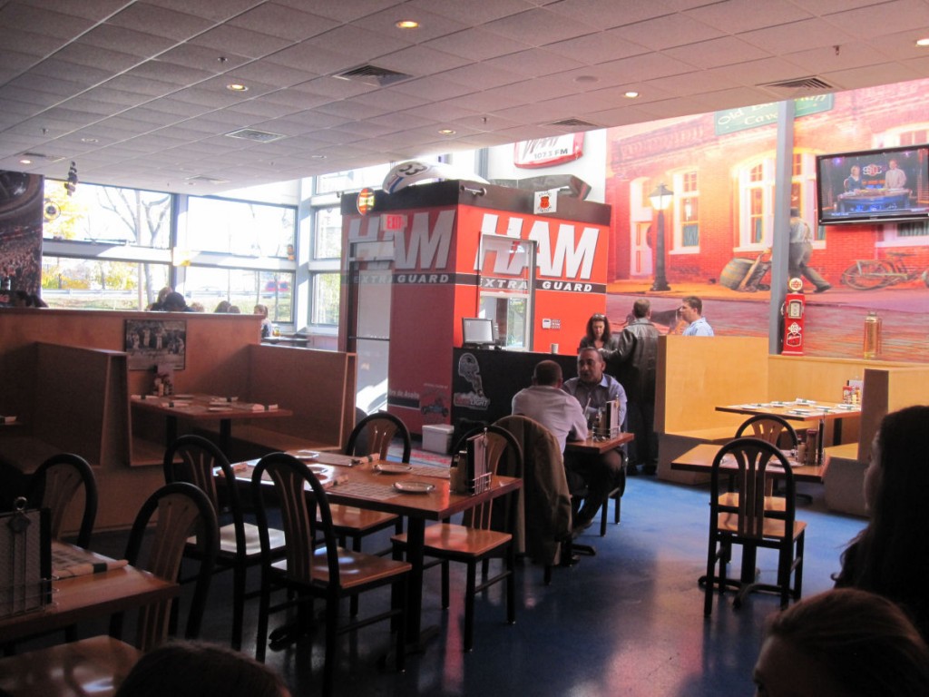
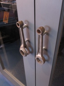
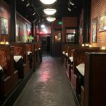
 I saw this door at a restaurant today. The decor is meant to look like a garage, and it’s pretty cool – I especially liked the naked closers. I did wonder about the main entrance door though. It’s tough to tell from the photos, but the graphics from the wall run over the aluminum portions of the door and frame and across the glass, so the glass is tinted orange with the dark stripes running across. You can barely see the word “extra” on the glass at the top of the door, but look at the window on the side of the vestibule – it’s the same treatment that’s on the door. When I looked at it from my seat it looked dark orange just like the wall.
What do you think?
(The code excerpt is on this post.)
Update: So far the consensus on my favorite codes discussion board is that the door is visible enough. I think I’ll have to go back for Happy Hour and take a picture without the bright sunlight behind the glass, because the door actually looks like the top half of the window near the hostess station (the bottom half of the window doesn’t have the graphic/tinting on the glass). If anyone wants to go on a field trip, let me know. 🙂
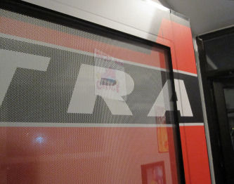
Update #2: Here’s a close-up of the glass treatment…I think it’s similar to the advertisements on buses and other vehicles. I’ll bet we’re going to see more of this on doors.
Update #3: Based on the close-up photo I added, the consensus from my code official friends is that this is a “no-go.” The door shouldn’t blend in with the wall. You could make the argument that a white door in a white wall blends, but I think the graphics make it less distinguishable than a plain door. One thing to note…this type of treatment could be really cool on the exterior side of a door…as long as it’s not on the egress side.
You need to login or register to bookmark/favorite this content.





No real problem with this one
The door is a different color
It appears to be a small lease space with maybe only two doors
And the humans go out the same door they come in, so they are trained
The door stands out from all the glass front
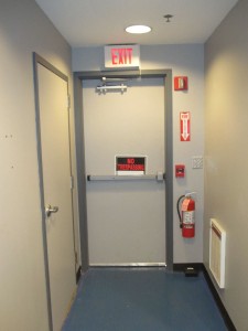
Look closely at the floor next to the back door. I think that is a rodent trap. How was lunch?
I noticed that too!! But not until I looked at the photo. Lunch was good, actually…the chocolate sprinkles on my ice cream tasted a little funny though. 🙂
I know it is not a code issue but I have never seen an emergency exit with a “No Trespassing” sign on it. Do they call the police if you use the door?
hey Lori, looks like a unique place to have a bite to eat, especially like the piston rod door pulls and well yea………the naked closer! that’s a first, I thought you HATED naked closers?!?! that one shown in image is NOT an ingersoll rand product, I have seen these in use before, I don’t call them by the proper brand they are, I call them “powermoaners” because of the spring groaning inside on the closer cylinder walls inside.
but yes, coverless in a garage environment looks perfect for the setting/theme of the place, (industrial look)
any garage doors or garage door openers found there???
-Jess
Hi Jess –
Normally I don’t like naked closers but I think it’s pretty cool for a garage-themed restaurant. At first I was like, “What the heck happened to all of their closer covers??” There are a couple of garage doors…I’m not sure if they’re just for show or not.